Transmission
This article says that a medium-security prison in Agassiz had an outbreak where 59 prisoners got sick.
This article says there was another outbreak at Kelowna General.
This article says that two cruise ships are scheduled to arrive on Thursday, and one has enough COVID-19 cases (>0.3% of passengers) to trigger an investigation. (I don’t know what “an investigation” means. Maybe they walk over and say, “Yep! You’ve got cases!”)
Mitigation Measures
This article says that a business in Vanderhoof was fined $5000 for COVID-19 safety plan violations. According to the article, they didn’t require customers to wear masks, (maybe they didn’t wear masks? hard to tell), they didn’t install dividers, and they didn’t allow an inspection.
This article says that UBC is extending its mask mandate until the end of June.
This article says that the province is spending a ton of money — including bursaries for the re-accreditation process — to speed up BC-licensing of foreign-licensed nurses.
This article says that for non-US citizens, you still have to have proof of vaccination to enter at land/ferry borders.
This article says travellers entering or re-entering Canada still need to wear masks in indoor public spaces for 14 days after crossing the border.
Testing
People don’t like the wastewater plots that MetroVan supplies every Friday. They say that the timescale is too short, that the dynamic y-axis is confusing, you can’t see all the plants at the same time, etc. Justin McElroy puts out occasional wastewater charts like this one:
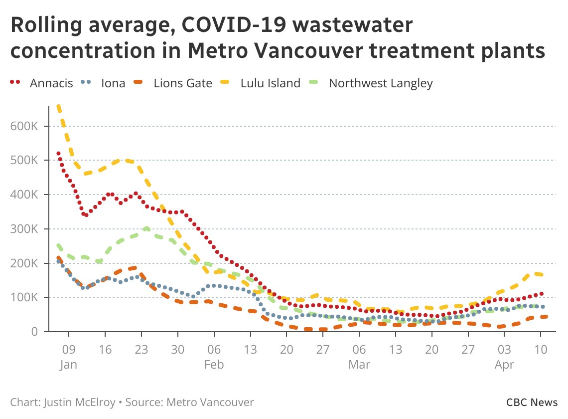
Pros: colourful, y-axis is short enough to show recent changes, can compare different plants easily. Cons: hard to get exact numbers, can’t see the whole history, doesn’t tell you which plant serves which area, can’t tell if it is raw numbers or adjusted for flow.
This guy made a bot to show charts:
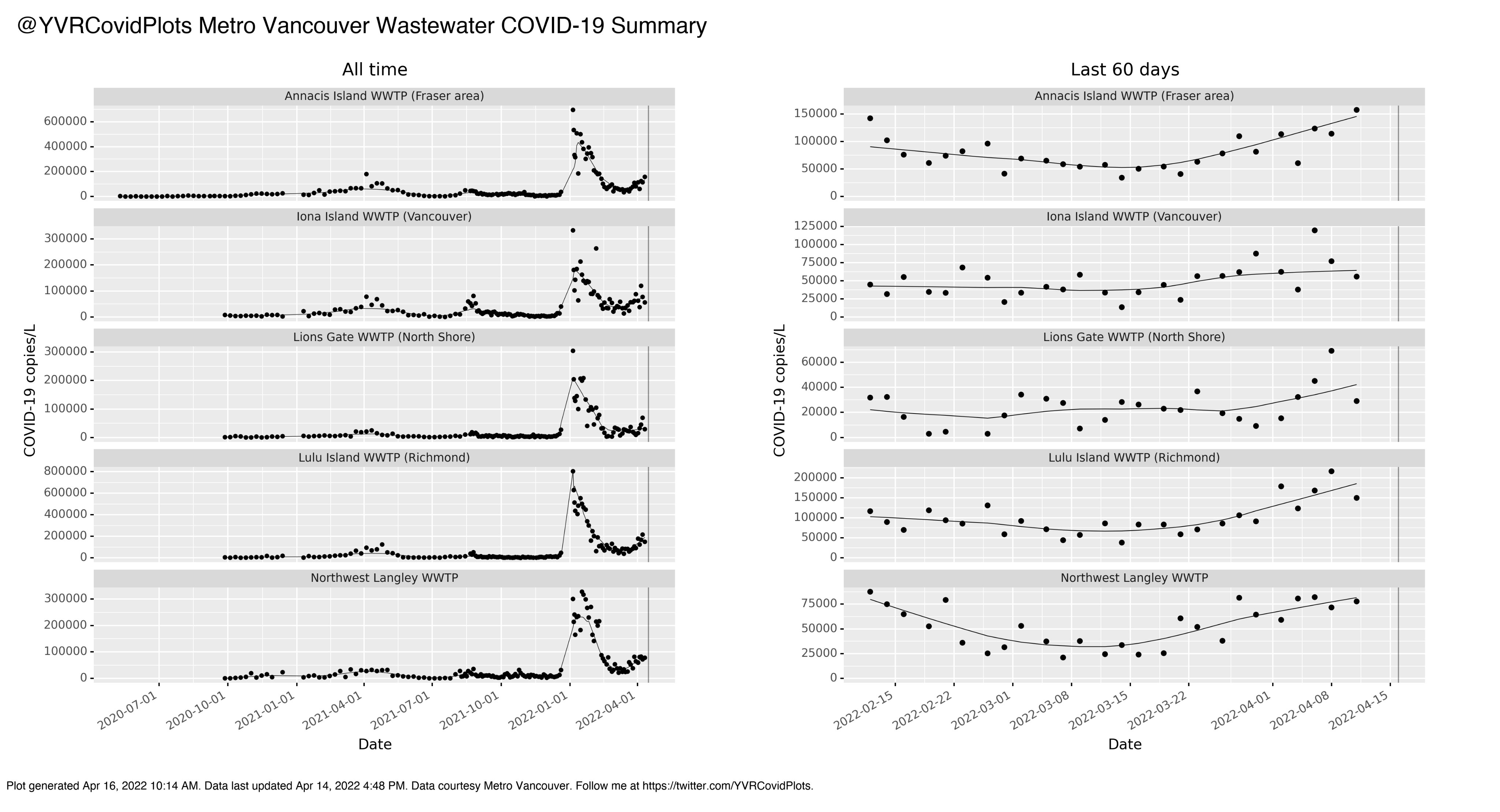
Pros: Can see both recent history and past history, easy to see all plants at the same time, clearly labels the metro region. Cons: y-axis is radically different for different plants, can’t tell if it is flow-adjusted.
A friend of mine made his own charts with Google Sheets (which means you can copy the data easily if you want) showing both 60-days and all-time:

Pros: colourful, can see both recent history and all-time history( not shown), includes data, clearly labelled that it is flow-adjusted, includes metro area, easy to compare with consistent y-axis. Cons: scraped by hand, so potentially inaccurate?
I believe all three of them will publish every Friday (when the data comes out), which doesn’t play well with my Thursday blog publication. I think what I will do is publish an additional, very simple blog post for BC on Fridays with the wastewater data and the vax by age over time (which also comes out on Fridays) and not much more.
Treatments
This article says that a fifth Long COVID clinic has opened, this one in Victoria.
Statistics
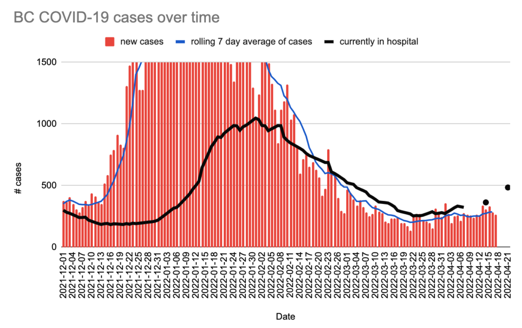
For the week ending 16 April, the daily averages were: 290.8 confirmed cases, 34.0 hospital admissions, 3.85 deaths, +310 first doses, +697 second doses, +3,221 other doses (3rd and 4th shots).
Currently 485 in hospital / 38 in ICU. (For comparison, the pre-Omicron max was 515 cases on 28 Feb 2021, when BC was doing a lot of testing. The Omicron max was 895 on 13 January 2022.)
Charts
The hospitalization black line has become black dots because the hospitalization numbers are only released once per week.
I am greatly uncomfortable about the hospitalization numbers because hospitalization is a lagging indicator, and we’re not seeing a big rise in cases. I’m pretty sure that means that the case numbers are crap: the case numbers will look small if you aren’t doing a lot of testing (WHICH WE AREN’T), but you can’t hide hospitalizations as easily.
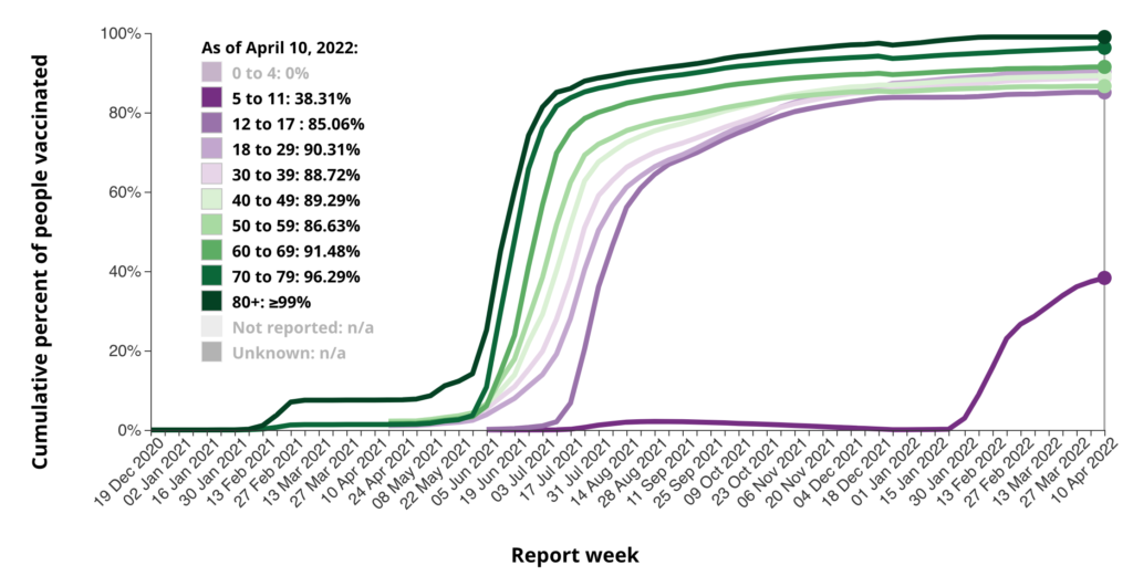
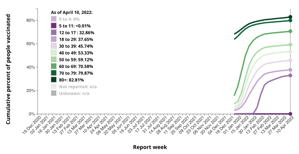
Vaccination rates by age over time for first, second, and third doses in BC (from the federal vaccination page):

